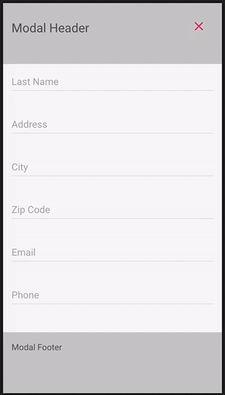
In this short post, I would like to demonstrate how to create a full sized modal view with fixed header and footer and scrollable content section.
TL;DR here's the result of this demo https://www.abrickis.me/labs#/modals
Lately here at Mintos we had to redesign the filters section for our loans’ marketplace. We did it by implementing a sidebar targeting large screens, similarly as it’s done on many e-commerce sites.
And for mobile devices with less space on the screen, we decide to go with the modal view containing the filter form and actions.
By examination the options of implementation of such a feature, we found a very simple solution which works on any browser. Either it’s an older version of IE or a more recent mobile browser such as Safari on iOS or Android’s web browser.
Let’s take a look at the code
First of all here is all the markup one needs. Containing an container element of modal and three child element for its header, content, and footer.
<div class="modal">
    <div class="modal__header"></div>
    <div class="modal__content"></div>
    <div class="modal__footer"></div>
</div>
And these are the style declarations for modal’s layout
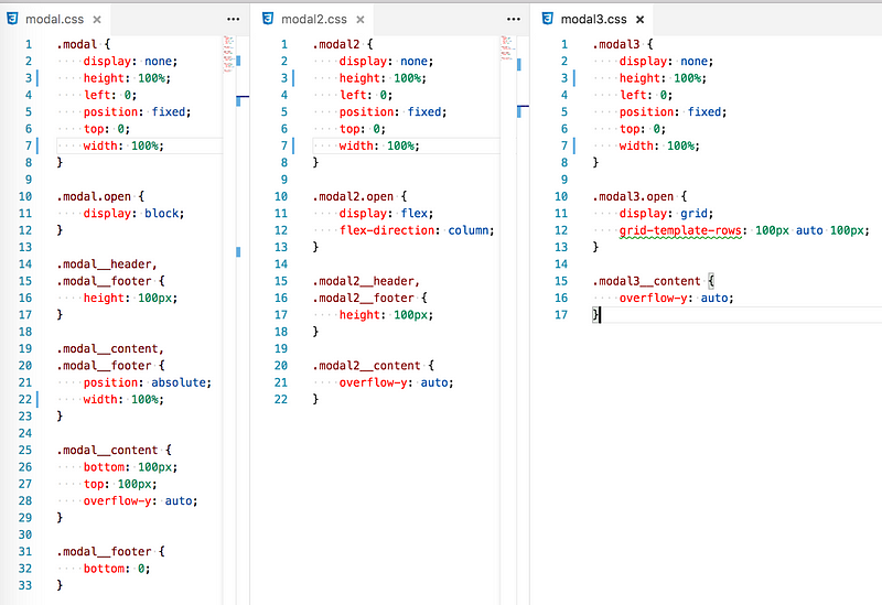
.modal {
    display: none;
    height: 100%;
    left: 0;
    position: fixed;
    top: 0;
    width: 100%;
}
.modal.open {
display: block;
} First, we set the style for the container by making it fixed and full width and height of the screen. In this example, the modal is not visible by default. We can use JS to toggle a CSS class .open to make it visible on the screen.
.modal__header,
.modal__footer {
    height: 100px;
}
.modal__content,
.modal__footer {
    position: absolute;
    width: 100%;
}
.modal__content {
    bottom: 100px;
    top: 100px;
    overflow-y: auto;
}
.modal__footer {
bottom: 0;
} And here are the styles for header, content and footer. I have made the header and footer 100px height. Because of this, the content of the modal must have a top and bottom offset when positioned absolutely. As you can see we don’t have to position absolute the header. All we need is to adjust the styles of footer so it’s positioned absolutely to the bottom.
This is it. With a couple of lines of HTML and CSS, and of course JS to toggle modal open state, we have created a full screen, responsive modal view with fixed header and footer, and scrollable content area.
The technique of using fixed and absolute positions are not the only options. Thanks to continuous evolution of CSS and browsers adopting these new features there are two more options I would like to show you.
Option #2: Flexbox
By applying display:flex; style declaration on modal open state. The CSS of our example becomes simpler. The base styles of the modal container don’t not change, but the open state has now display:flex; and flex-direction:column; which determines that the child elements of modal should be laid out in a column.
.modal2 {
    display: none;
    height: 100%;
    left: 0;
    position: fixed;
    top: 0;
    width: 100%;
}
.modal2.open {
display: flex;
flex-direction: column;
} .modal2__header,
.modal2__footer {
height: 100px;
}
.modal2__content {
    height: 100%;
    overflow-y: auto;
}
Option #3: CSS grid
With the flexbox example, I showed how it can be done a bit simpler comparing to the fixed/absolute position approach. But it can be made even simpler utilizing latest CSS power feature — CSS grid.
Similarly to the previous example, the markup remains the same. All that is changed is the CSS for the modal’s open state. When modal has CSS class open it has a display:grid; style declaration. Which determines that the content of the modal view should be laid out using the new and powerful CSS two-dimensional layout system.
As we are stacking the modal content in a single column we can set the heights by using grid-template-row: 100px auto 100px; This will set 100px height to the first and last child in modal, respectively, to the header and the footer. And the content is instructed to take up all the remaining vertical space by setting auto in template rows’ height declaration. How simple is that!
.modal3 {
    display: none;
    height: 100%;
    left: 0;
    position: fixed;
    top: 0;
    width: 100%;
}
.modal3.open {
display: grid;
grid-template-rows: 100px auto 100px;
} .modal3__content {
overflow-y: auto;
} So this was a short and simple example how to create a responsive modal view with fixed header and footer. And before I go, this is how all the 3 option’s CSS looks compared side by side (see it in action on https://www.abrickis.me/labs#/modals)